
Lucy Cara Dökel
Student at HS-Anhalt
Student at HS-Anhalt


The Dessau Deign Schau is a biannual event where Integratded Design Students get the opportunity to show their semester work and Organize their exhibition. The Dessau Design Show, also known as "DDS", offers students the opportunity to show their work and gives applicants a glimpse of our degree programme. And of course parents and design enthusiasts from Saxony-Anhalt and the surrounding area have a great opportunity to get inspired and browse through various projects from Product Design to Movies.


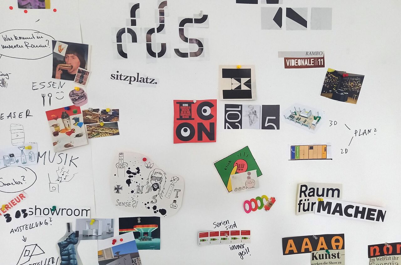

The aim of our project was to develop a corporate identity that could be used individually for each semester and could be changed in the future. In other words, a sustainable sythem that offers recognition and easy adaptation, but also induíviduality. In the beginning, we collected materials, words, design inspiration and photos in many brainstorming cycles, which we associate with the DDS. Based on this, we then each captured rough ideas in the form of poster sketches.

↑ my ideations


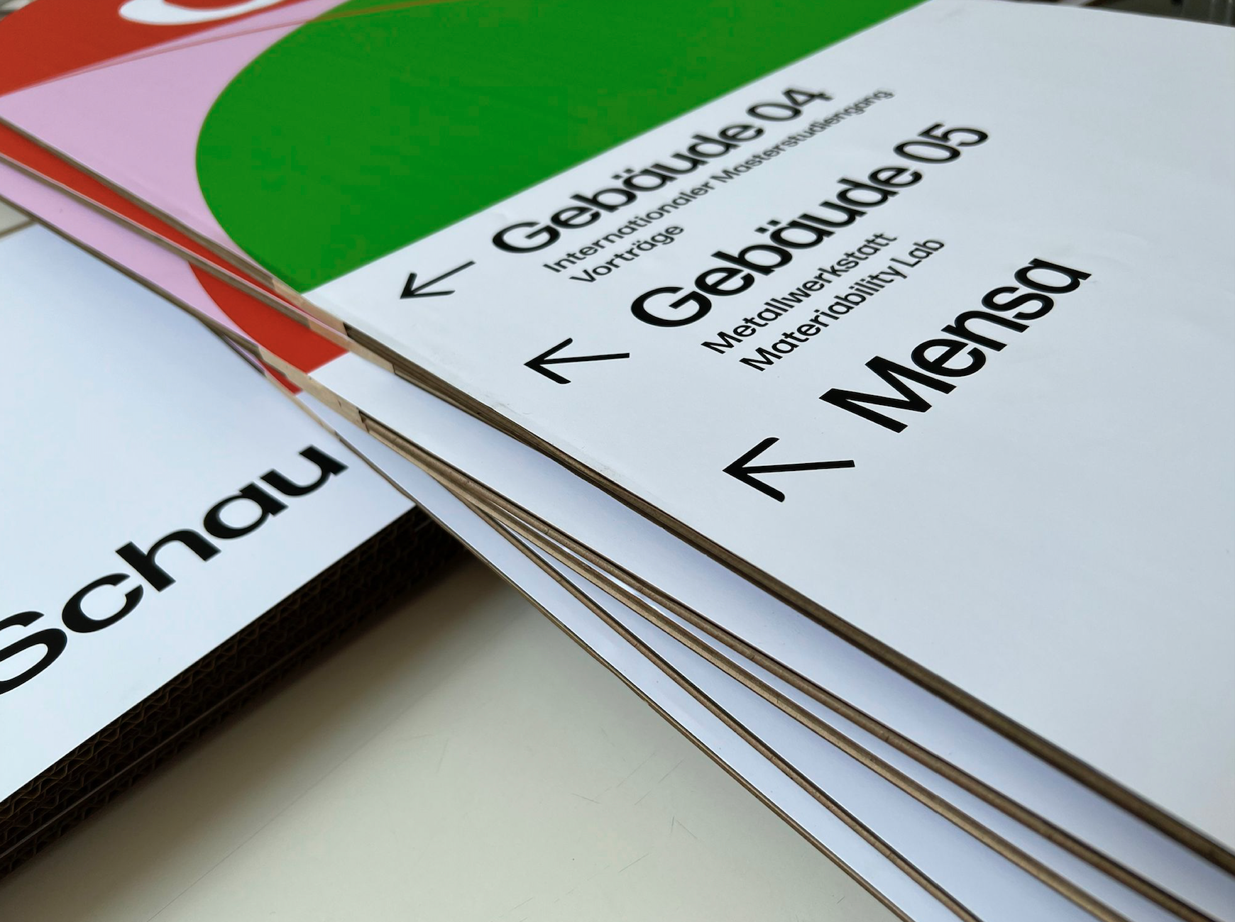
The developed corporate identity consists of four main components. A grid that holds the design elements together, three colours and four different shapes that can be combined with each other. And lastly the Forma DJR as font. Alltogether this system is transferable to everything from banners, Posterns, Guidance systems and Websites.


During the Project I did a website in about 2 days time (in webflow). To set the website apart and make better use of the medium, animated GIFs were created. These animations constantly change, adding a dynamic and engaging visual element that enhances the overall user experience.

The final colors go very well with the summer time of the event. The red conveys excitement and energy, whereas the green reflects calming and lively summer days. The pink has a sweet light touch and loosens up the connection.


The shapes have a friendly and open effect due to their curves in combination with the colours.


We have decided on different types of the Forma DJR as typeface for Headlines (Display Medium) and Text (Mikro Regular). The geometry of this typeface makes it simple and matter-of-fact, but the rounded corners give it a certain of approachability and make it less hard.


The grid consists of square blocks and can be composed of different numbers of squares in height and width. This makes it adaptable to different formats. A square can either contain writing or coloured Forms.

This is an example of the application of this grid for the Dessau gazette. If, as here, the format is not freely selectable and cannot be divided into the squares, a column at the edge of the grid can be used for additional information.


One Semester Apr 22 — Jul 22
Participants
Tobias John, Alexandra Franke, Max Bureik, Moritz Michael, Cindy Schmidt, Jasmin Fischer, Erikamaria Morgenstern, Eileen Frech, Nicola Wolf, Vanessa Hüttel, Luise Häntzsche, Lena Seidel, Luisa Schröteler, Coco Naomi Stolz, Lucy Cara Dökel
My Role
Ci Development (Font Logo, Color)
Grid
Styleguide
Website